
Color is one of the most powerful tools in interior design, capable of transforming not just the appearance of a space, but the way we feel and function within it. At Aster Home Design, we understand that choosing the right color palette goes far beyond aesthetic preferences—it's about creating environments that support your lifestyle, enhance your well-being, and reflect your personality.
The psychology of color in home environments is a fascinating intersection of science, art, and human experience. Research has shown that different hues can influence our emotions, energy levels, and even our physical responses. Whether you're looking to create a calming bedroom retreat, an energizing home office, or a welcoming living space, understanding color psychology is essential to achieving your design goals.
Understanding Color Psychology Fundamentals
Color psychology examines how different hues affect human behavior and emotions. While individual responses to color can vary based on personal experiences and cultural backgrounds, certain patterns emerge consistently across populations. Warm colors like reds, oranges, and yellows tend to energize and stimulate, while cool colors such as blues, greens, and purples typically calm and soothe.
Key Insight:The intensity and saturation of a color matter just as much as the hue itself. A soft, muted blue creates a very different atmosphere than a vibrant, saturated blue, even though they share the same basic color family.
When selecting colors for your home, consider not only the psychological effects of individual hues but also how they interact with natural light, artificial lighting, and surrounding colors. The same paint color can appear dramatically different depending on the time of day, the direction your windows face, and the other elements in the room.
Color Palettes for Different Rooms
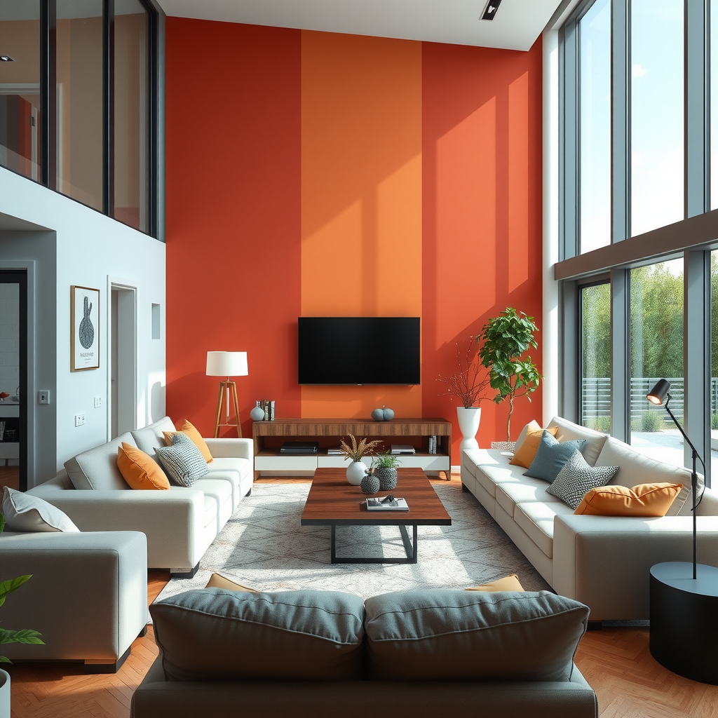
Living Rooms: Creating Welcoming Spaces
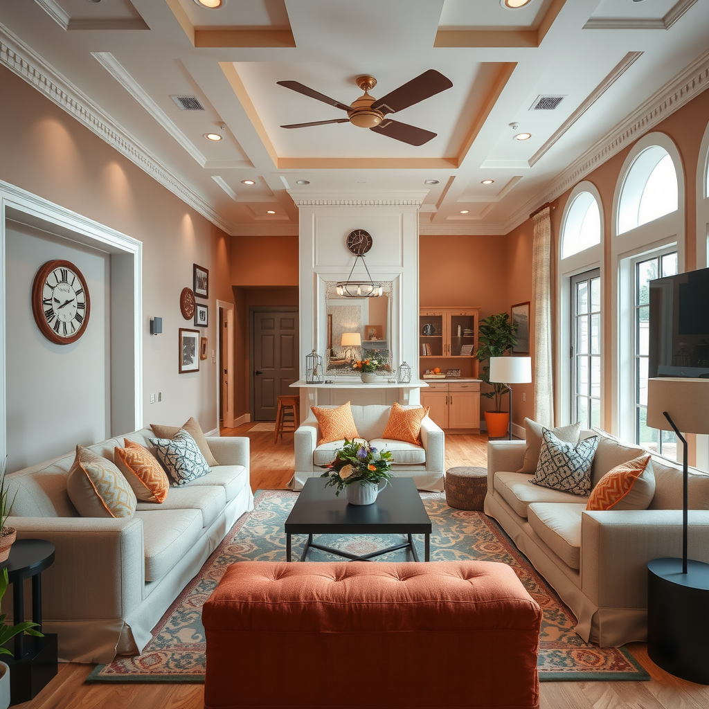
Living rooms serve as the heart of the home, where families gather and guests are welcomed. The ideal color palette should promote conversation, comfort, and connection. Warm neutrals like beige, taupe, and soft gray create a versatile foundation that welcomes everyone.
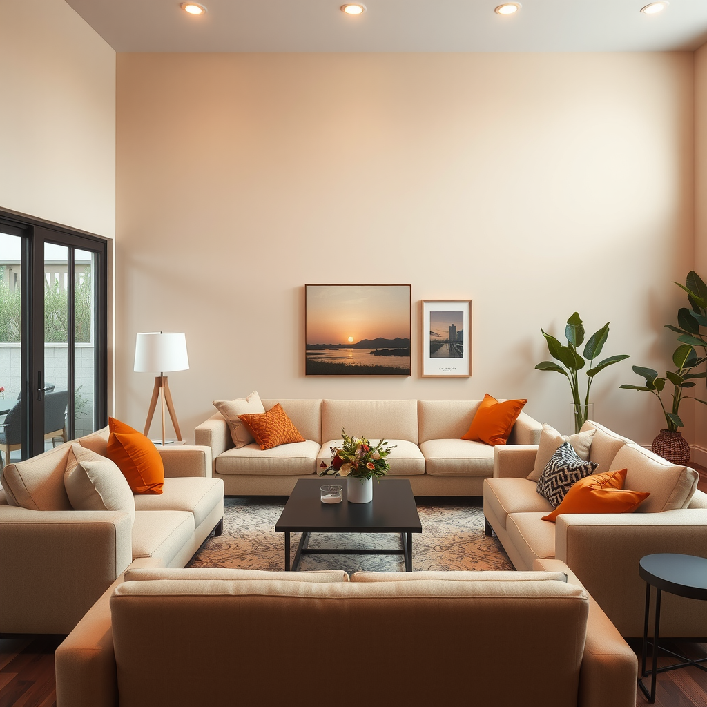
Consider incorporating accent colors that add personality without overwhelming the space. Terracotta, sage green, or warm mustard can introduce energy and visual interest while maintaining a harmonious feel. These accent colors work particularly well in throw pillows, artwork, or a single accent wall.
Bedrooms: Designing for Rest and Relaxation
Bedrooms should be sanctuaries of calm and rest. Cool, muted tones are ideal for promoting relaxation and quality sleep. Soft blues, gentle greens, and lavender hues have been shown to lower heart rate and blood pressure, creating optimal conditions for rest.
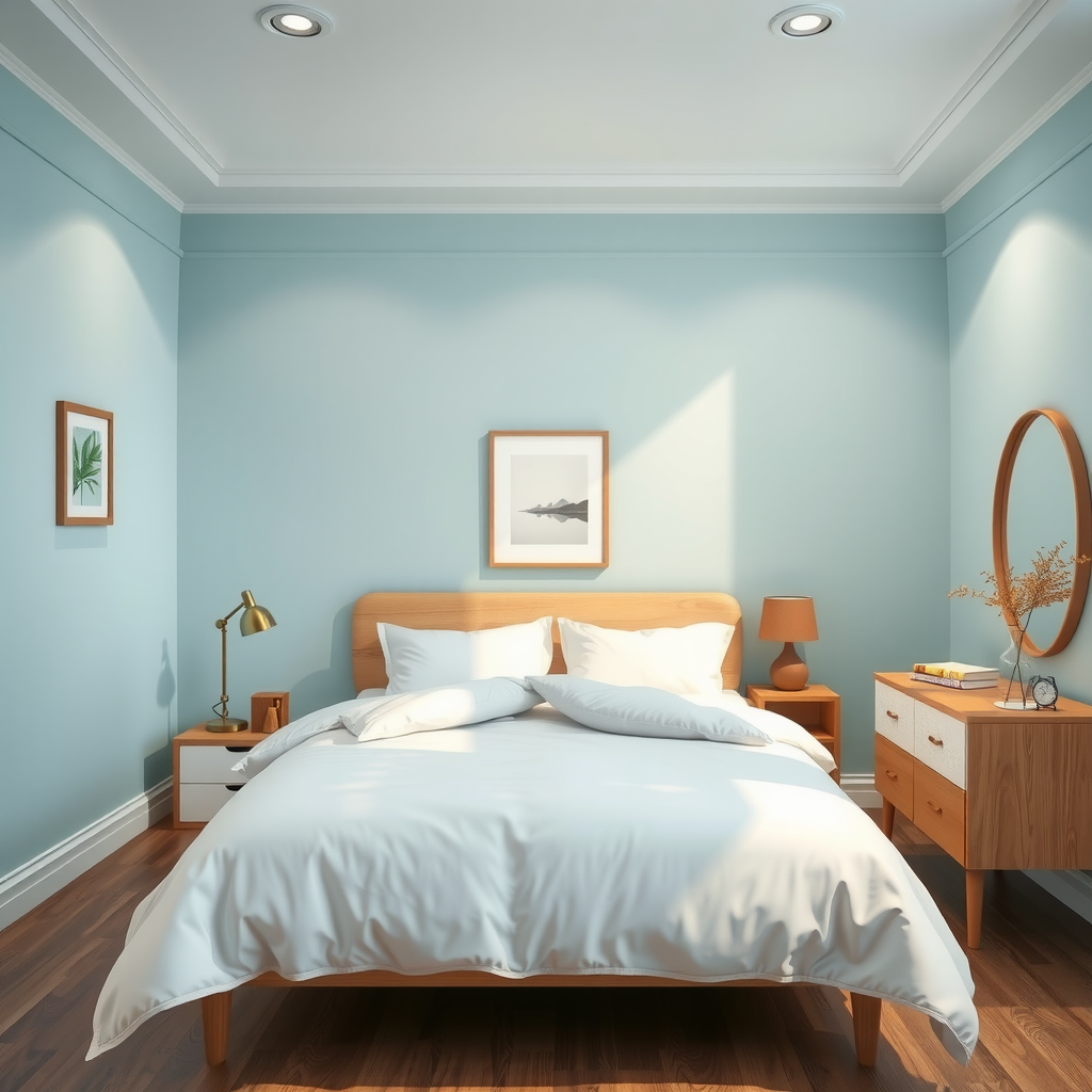
Avoid overly stimulating colors like bright reds or intense oranges in the bedroom. If you love warm colors, opt for softer versions like dusty rose or peachy beige. These provide warmth without the energizing effects that might interfere with sleep.
Home Offices: Boosting Productivity and Focus
With more people working from home, creating a productive office environment has become increasingly important. Colors that enhance focus and mental clarity are essential. Blue is particularly effective for concentration and productivity, while green promotes balance and reduces eye strain during long work sessions.

Consider using energizing accent colors like yellow or orange in small doses to stimulate creativity and enthusiasm. These can be incorporated through desk accessories, artwork, or a single accent wall behind your workspace.
Kitchens: Energizing Culinary Spaces
Kitchens benefit from colors that stimulate appetite and encourage social interaction. Warm colors like yellow, orange, and red can make the space feel inviting and energetic. However, balance is key—too much intensity can be overwhelming.
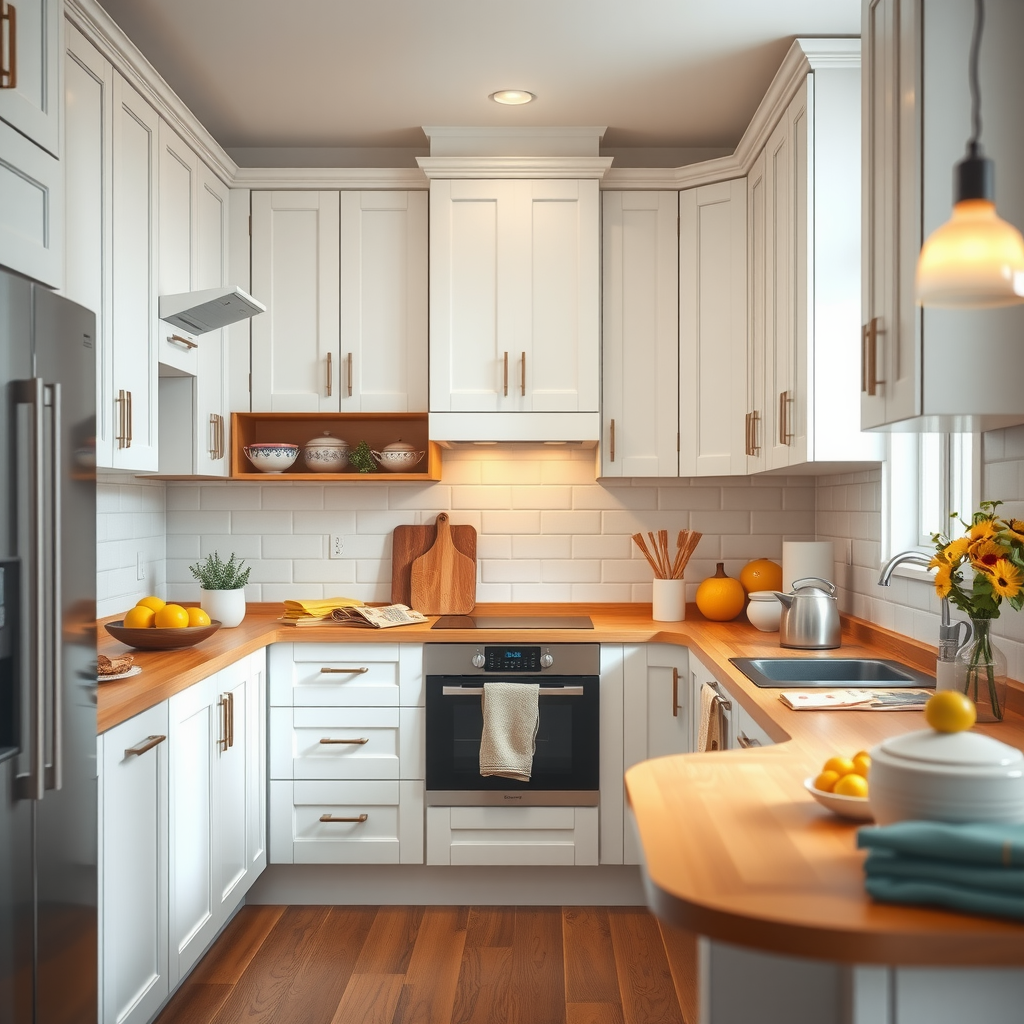
White or cream cabinets paired with warm wood tones create a classic, timeless look that feels both clean and welcoming. Add pops of color through backsplash tiles, small appliances, or fresh flowers to inject personality without committing to a bold wall color.
Bathrooms: Creating Spa-Like Retreats
Bathrooms should feel clean, fresh, and rejuvenating. Light, airy colors work best in these spaces. Soft blues and greens evoke water and nature, creating a spa-like atmosphere. White and light gray provide a clean canvas that makes the space feel larger and more open.
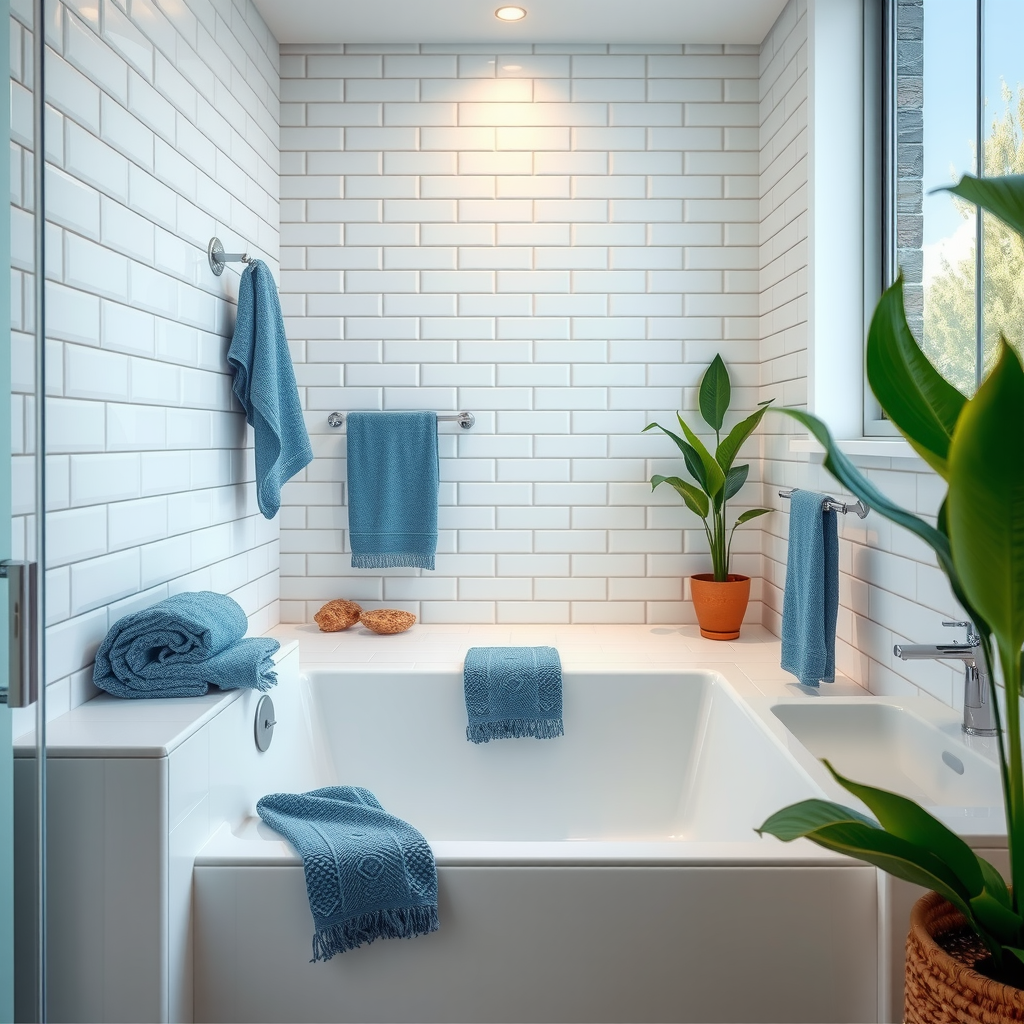
For a more dramatic look, consider deep navy or forest green on a single wall, balanced with plenty of white fixtures and bright lighting. This creates visual interest while maintaining the clean, refreshing feel essential to bathroom design.
Popular Color Combinations and Their Effects
Practical Tips for Implementing Color Psychology
Getting Started with Color
- Test before committing:Always paint large sample swatches on your walls and observe them at different times of day. Colors can look dramatically different in morning light versus evening light.
- Consider the 60-30-10 rule:Use your dominant color for 60% of the room (usually walls), a secondary color for 30% (furniture and textiles), and an accent color for 10% (decorative elements).
- Start with neutrals:If you're unsure about bold colors, begin with a neutral base and add color through easily changeable elements like pillows, artwork, and accessories.
- Think about flow:Consider how colors transition from room to room. While each space can have its own personality, maintaining some color continuity creates a cohesive feel throughout your home.
- Account for existing elements:Consider the colors of your flooring, furniture, and fixed elements when selecting wall colors. These should work harmoniously together.
The Impact of Natural and Artificial Light
Light plays a crucial role in how we perceive color. Natural light changes throughout the day, affecting how colors appear in your space. North-facing rooms receive cooler, more consistent light, while south-facing rooms get warm, bright light that can intensify colors.
Artificial lighting also significantly impacts color perception. Warm white bulbs (2700K-3000K) enhance warm colors and create a cozy atmosphere, while cool white bulbs (4000K-5000K) work better with cool colors and provide a more energizing light. Consider using dimmer switches to adjust lighting levels based on the time of day and desired mood.
Pro Tip:When testing paint colors, observe them under both natural daylight and your artificial lighting at night. A color that looks perfect during the day might feel completely different in the evening.
Cultural Considerations in Color Psychology
While many color associations are universal, it's important to recognize that cultural background can influence how we respond to different hues. In Western cultures, white often represents purity and cleanliness, while in some Eastern cultures, it's associated with mourning. Red symbolizes luck and prosperity in Chinese culture but can signify danger or warning in Western contexts.
When designing your home, consider your own cultural background and personal associations with different colors. The most successful color schemes are those that resonate with you personally, creating spaces where you feel truly at home.
Creating Harmony Through Color
The ultimate goal of applying color psychology in your home is to create spaces that support your well-being and enhance your daily life. This means choosing colors that not only look beautiful but also make you feel good. Pay attention to how different colors affect your mood and energy levels in your current space, and use these insights to guide your design decisions.
Remember that there are no absolute rules in color psychology—what matters most is how colors make you feel in your own home. While understanding the general principles of color psychology provides valuable guidance, your personal preferences and lifestyle should always be the primary consideration.
Conclusion: Your Personal Color Journey
Understanding the psychology of color empowers you to make informed decisions about your home environment. Whether you're planning a complete renovation or simply refreshing a single room, considering how colors affect mood, productivity, and well-being will help you create spaces that truly support your lifestyle.
At Aster Home Design, we believe that every home should be a reflection of its inhabitants—a place where color, light, and design come together to create environments that nurture, inspire, and delight. By thoughtfully applying color psychology principles while honoring your personal preferences, you can transform your house into a home that not only looks beautiful but feels exactly right.
Start your color journey today by observing how different hues make you feel, experimenting with samples, and gradually building a palette that brings harmony and joy to your living spaces. The perfect color scheme for your home is waiting to be discovered—one that reflects your personality, supports your well-being, and creates the atmosphere you've always dreamed of.